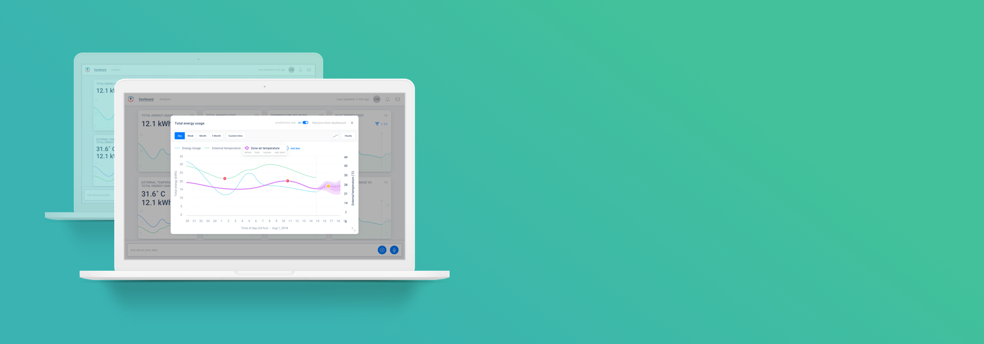
EMS Dashboard
Web app for monitoring energy metrics in data centers

My contribution: I designed the UX and UI while working with the data science team to ensure the experience complimented the their machine learning models and data visualization best practices.
This app was like a smart thermostat for mega data centers where even a fraction of a reduction in energy usage could mean millions of dollars saved.

Wireframes
The main feature of the EMS dashboard UX was simple data visualization, but the true power of the product came from the AI under the hood.
Even so, I sought to put in several novel features that users would find useful to compare their data.

EMS Final Designs
I designed a lot of screens. A lot.
Many of these screens were built to show the many possible steps in the various process flows. We relied heavily on prototyping in Invision to make sure the product was as polished and useful as possible.

Various data types
One challenge we encountered was showing and comparing various types of data that couldn’t necessarily be compared with the same time line or metrics.
We found clever ways of switching certain metrics, or groups of metrics, on or off, so users could easily isolate data and have flexibility in how the data was visualized.

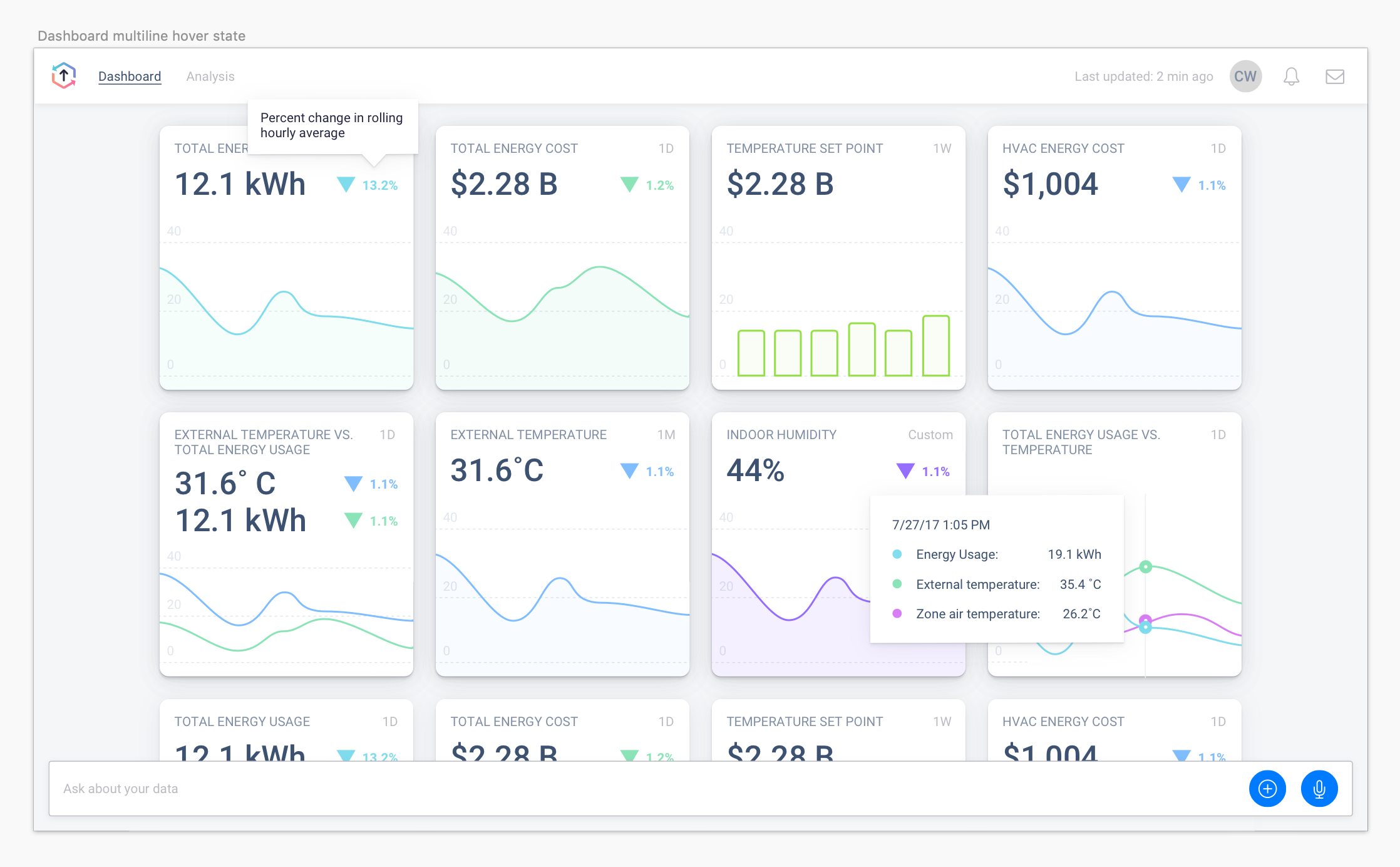
Dashboard design
The dashboard gave users an initial launchpad to see if any particular data stood out. They could hover over the charts to see quick comparisons of data points, and the large number top left would show the metric value at the most recent reading.
Now let’s get started on your project! Contact me with the form below, or shoot me an email at chris@cwestgate.com