
BetterUp Care Outcomes
A well-being focused employee benefit product including 1:1 personal coaching along with other resources and tools.
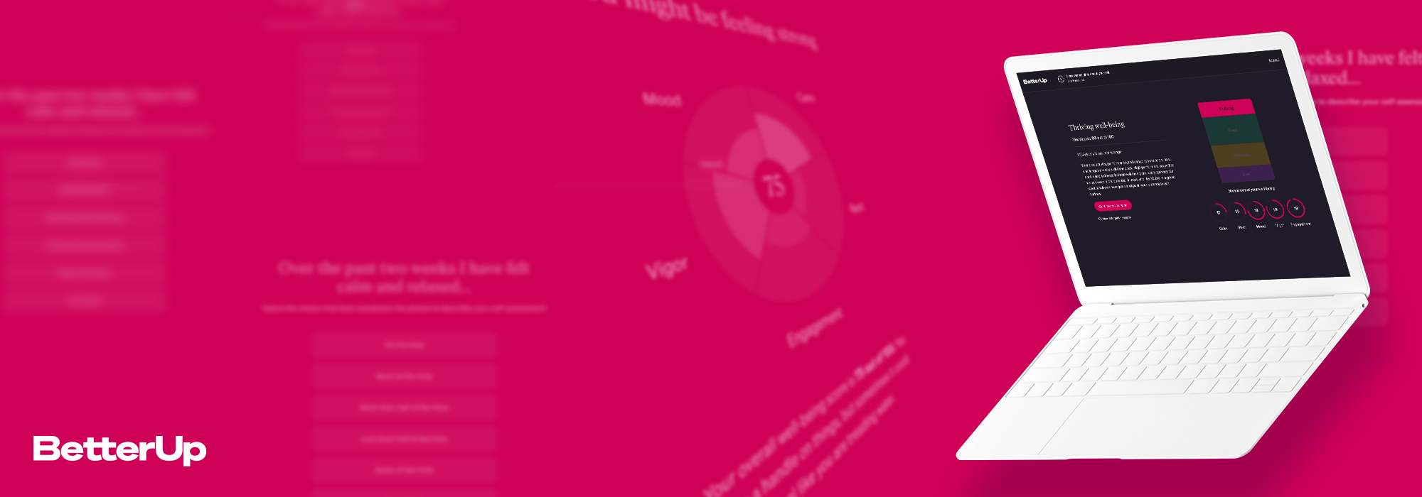
The goal of this project was to introduce a well-being baseline assessment into the set up flow of the product so that the users, their employers, and BetterUp as a company could see the well-being benefit that the Care product gives over time.

From internal research, we found out that our users (called Members at BetterUp) really wanted a clear measurement of the benefit they received by using our platform.
We also found that companies (called the Partners) wanted the same measure to see their return on investment for their employees.
That meant we would need a baseline measurement before they use the service, that the Member would complete again in the future to see their progress.
Building a well-being assessment wasn’t our only challenge in this project, though.
It turned out that we would have a balancing act between gathering this important well-being data for Members and Partners and maintaining profitability.
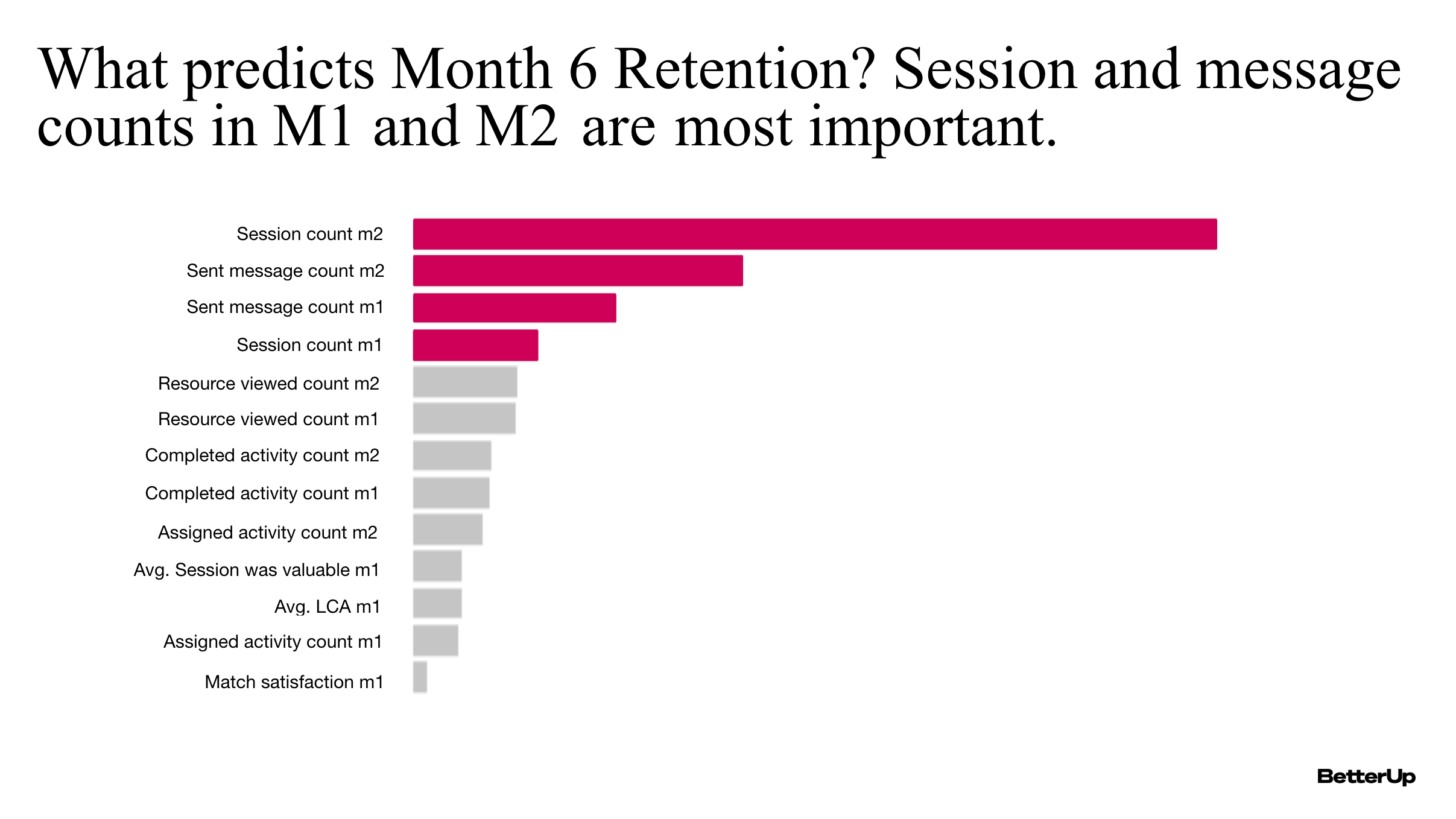
By looking at our data we found out that number of coaching sessions in the first two months was the biggest indicator that a Member will continue to be engaged 6 months in. That made sense, as coaching was one of the biggest value adds for Members on Care.
Because Care only bills per employee in a month in which that employee engages, we learned that it was critical for remaining profitable that members get through onboarding smoothly, sign up with a coach, and start attending sessions.
We found that every step we added to onboarding, increased the amount of drop-off before the Member saw their coach options, so this became the challenge for this project:
We needed to add in a well-being measurement that was short enough to keep members from leaving before finding their coach, but also packed with enough value that Members could see a strong benefit in trying the service out.
We knew we needed a short but powerful assessment.
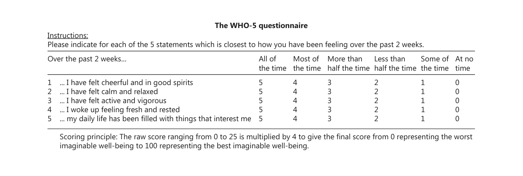
Our amazing clinical team helped to find the best science-backed, but short assessment that would still give us a clear picture of Members’ well-being.
They chose the WHO-5 assessment - a standard, plain language assessment created by the World Health Organization. It was perfect because it was short and clear, only 5 questions.
Over time, WHO-5 became synonymous with this onboarding assessment project.

Once we were sure of the assessment we wanted to use, I created some initial user flows. What you see in blue was the existing user flow for onboarding to Care, and the yellow and orange are the WHO-5 additions.
The biggest point of drop-off in our set up funnel was the coach matching page towards the end, so we chose to place the assessment before the coach matching page in order to establish our baseline with as many Members as possible.
This placement also worked nicely to position the Coaching experience as a great way to boost your well-being results.
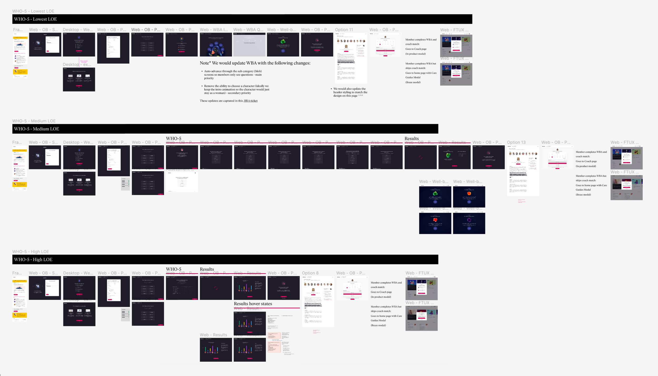
When you are designing on a deadline and with limited team resources you often need to design a range of solutions.
Each option I designed here has a small, medium, or larger level of effort to implement.
The lower effort designs generally reused more existing components from other places in the product or had simpler implementation.
More effort for engineering is not synonymous with better UX, but sometimes it is the case that the experience that’s best for the user does take the most effort from the engineers.
With this system, the team can decide together which option we have the bandwidth for that meets our project goals. If we choose a lower level effort option, we can always target one of the higher effort/better experience options in future iterations of the experience.
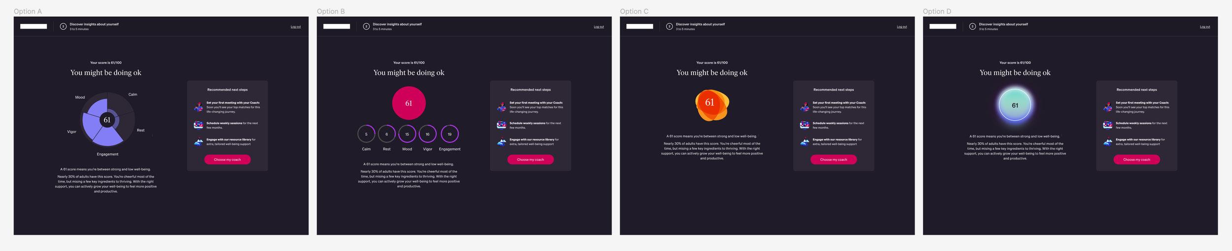
It’s important to design an experience that resonates with users, and we can save a lot of headaches by testing designs with users before we build them.
The results page of the WHO5 assessment are the big payoff for the Member completing the assessment, and these results lead directly into the coach selection screen. So we knew that this page would require extra attention.
I ran usability tests to see what designs resonated with Members, what did they get value from, what questions did they have, and more. The findings were crucial!
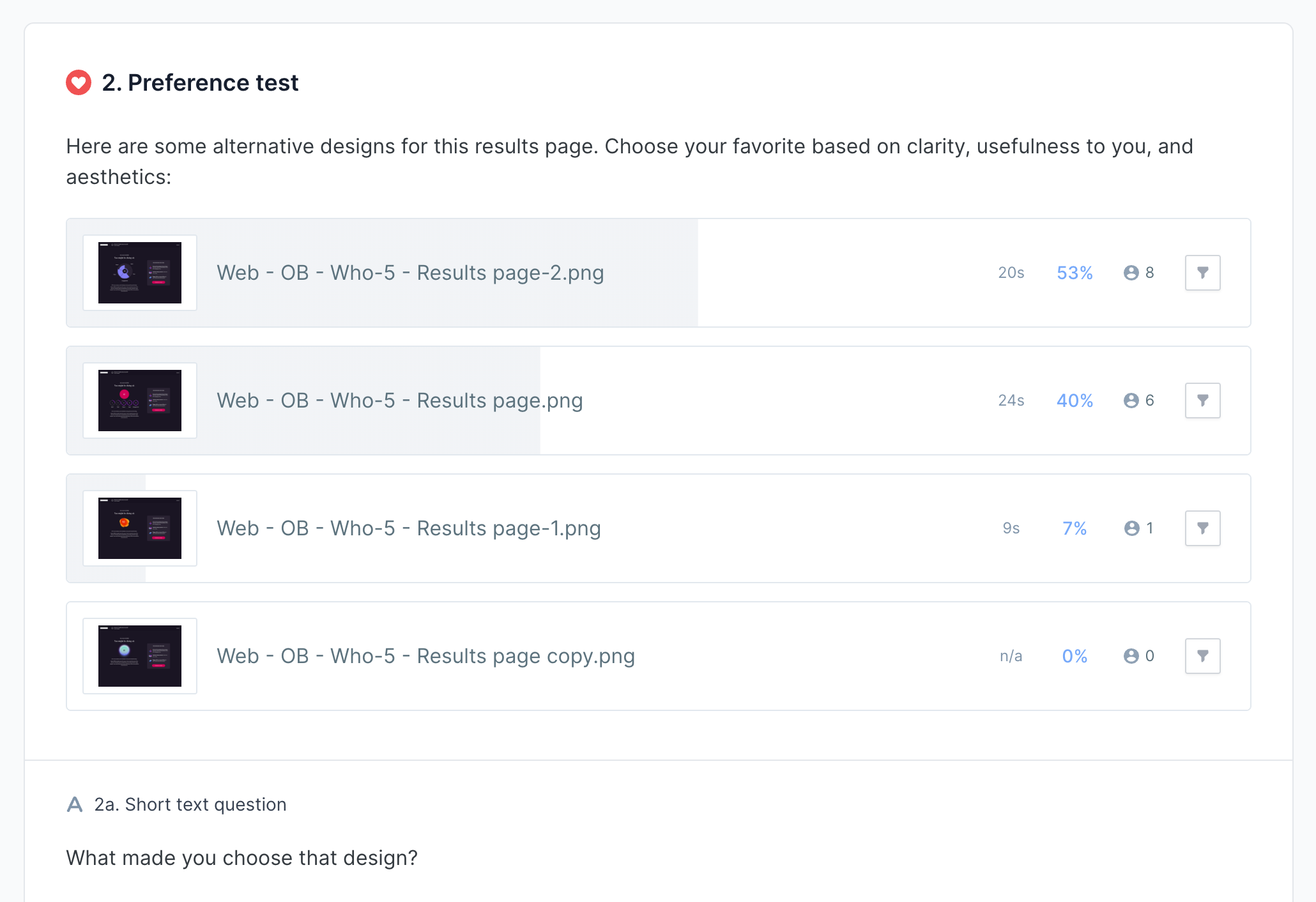
Members favored the results page designs that had a break down of the categories that made up their total score.
They also though, asked a lot of questions about how they should contextualize their score: how do they compare to similar populations, how do we define the score they received, how can they improve their score, what are the other possible results?
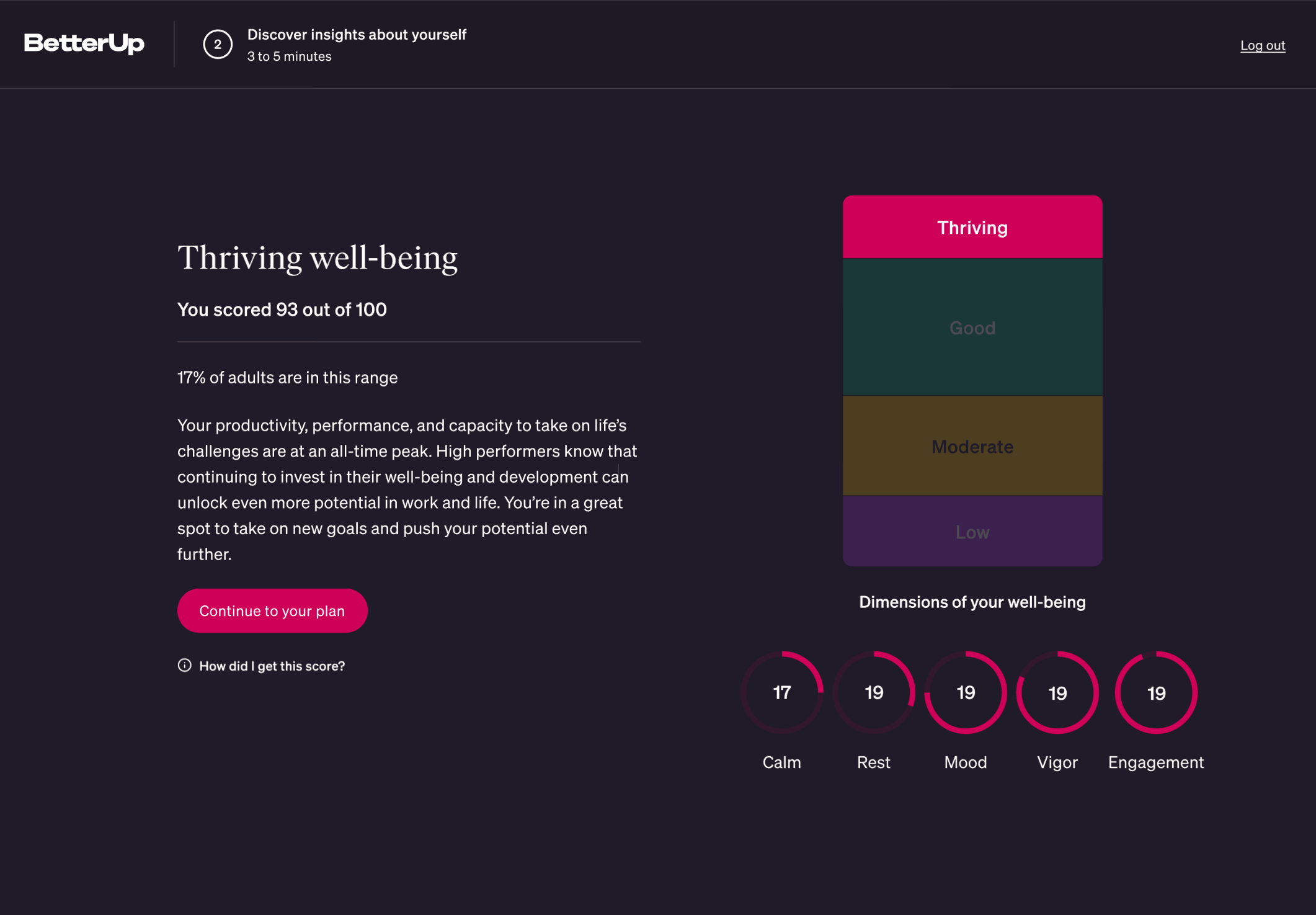
We settled on a design that contextualized the results for the Member while breaking down the parts that made up their score.
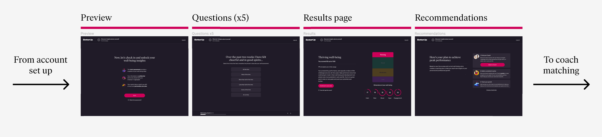
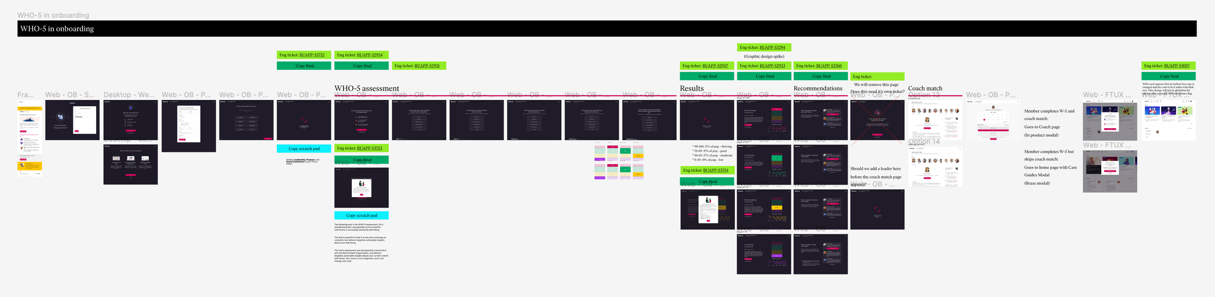
Above is the final hi-fidelity design flow we committed to for v1 of our WHO-5 experience.
At this point, I passed designs off to the engineers and worked with copywriting to polish text.
Once the engineers finished building, we all took a QA pass together to ensure that the designs met acceptance criteria, that there were no unanticipated usability issues, and that everything worked properly.
…Product design is never complete though! We can always iterate and improve on our work.
So as the team was building out the V1 designs, I carried out more research to find out the best next steps we could take to improve the experience even more, when the time came post-launch.
I conducted user interview sessions where I walked through the prototype experience with interviewees who were seeing our service for the first time, to get their fresh take on the experience.
Findings from the research lead to some key insights:
• Members wanted something actionable right away that they could do to improve their score.
• Even though coaching was the main product, they felt like we were pushing them too hard towards coaching, when we had other great offerings like workshops and resources to choose from.
• They wanted their recommendations to feel more connected to their individual results.
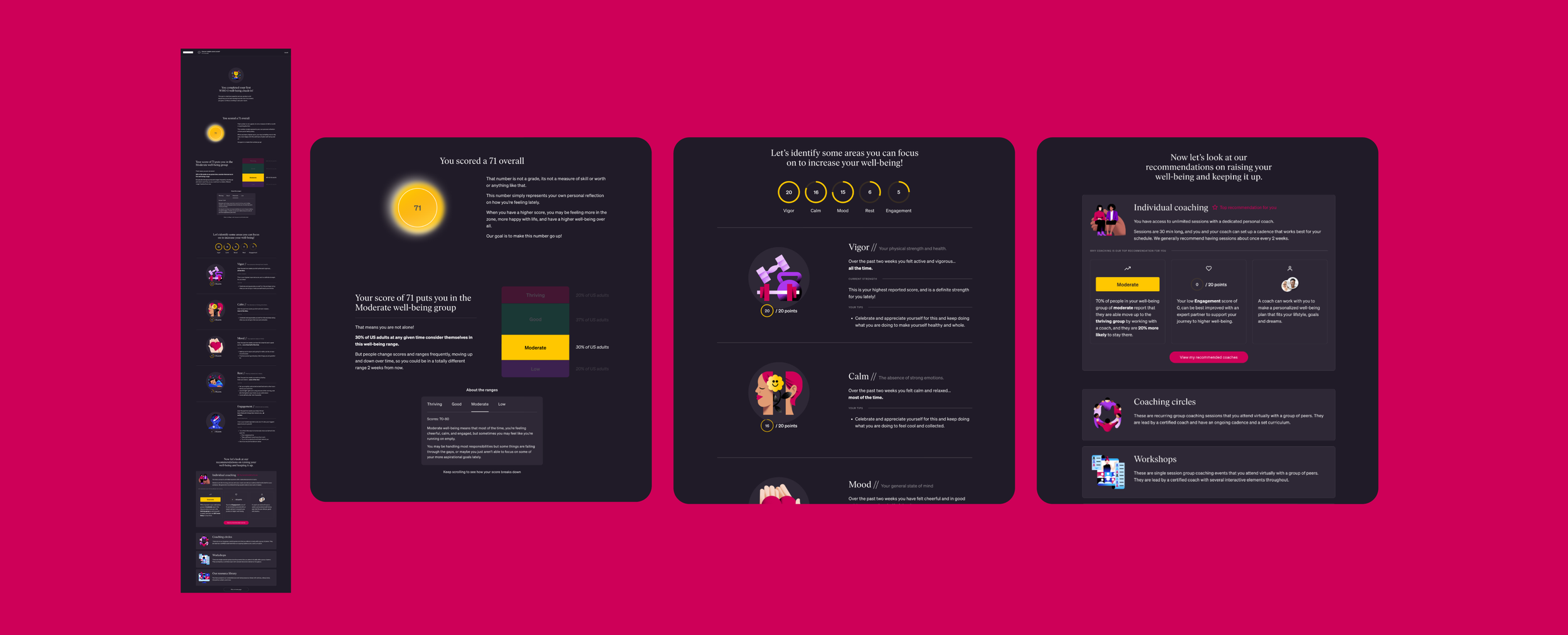
Taking that feedback into account, I created a new design.
This design featured a single scrollable results page, to emphasize the depth of the value and to give more space for a clear narrative about the results. Extra info was no longer hidden inside tool tips.
To give more instant value, we added customized tips based on scores into each subdimension area, as well as clear description of the subdimensions.
In the recommendations area, we included more info about some of the other useful product offerings rather than pushing too hard on Coaching, and wherever possible we added call backs to previously stated results, so the recommendations felt truly tailor-made.
Subsequent interviewees were more likely to rate this onboarding experience as a 5/5 in value compared to the previous version, so we knew we had made a big improvement.
Now let’s get started on your project! Contact me with the form below, or shoot me an email at chris@cwestgate.com
More projects
 BetterUp WorkshopsRedesign of a group coaching experience
 Mai 2dSocial media app with custom animated avatars
 Mai 3dAR integrated version 2.0 of social app
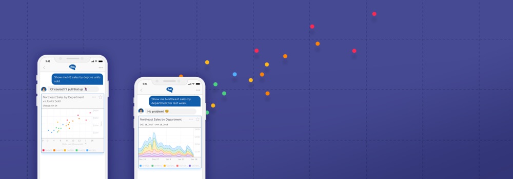 Hai Business AnalyticsAI-powered virtual assistant for sales data
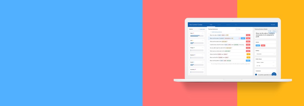 Hai DashboardCustomization tool for virtual assistant voice commands
 EMS DashboardAI-integrated energy management for data centers
 Carbon RelayEnergy management company branding and site optimization
 ChatterplotSocial site for in-person language learning exchange