Carbon Relay
Site design and strategy for AI energy company

My contribution: I designed the full site and branding.
Carbon Relay had a long client acquisition process because the projects they took on were so big. The goal with the site became educating visitors on CR’s solution and funneling them towards contact with one of our sales reps.

Logo Design
The company was emerging as a cutting edge tool for businesses to not only save money but also to cut their carbon impact. The logo needed to be modern and smart while instantly recognizable with the wordmark or if only displayed as the logomark.
To highlight the carbon savings and the futuristic nature of the company, I designed this logo around the hexagon shape, reminiscent of carbon atoms in a lattice.
The colors represent warm and cold, as our first tool dealt primarily with heating and cooling systems in data centers. The encircling arrows are meant to evoke recycling and the eco friendly nature of the service, while the upward arrow represents progress, growth, savings, and the return on investment usage of the service would give.

Styleframes
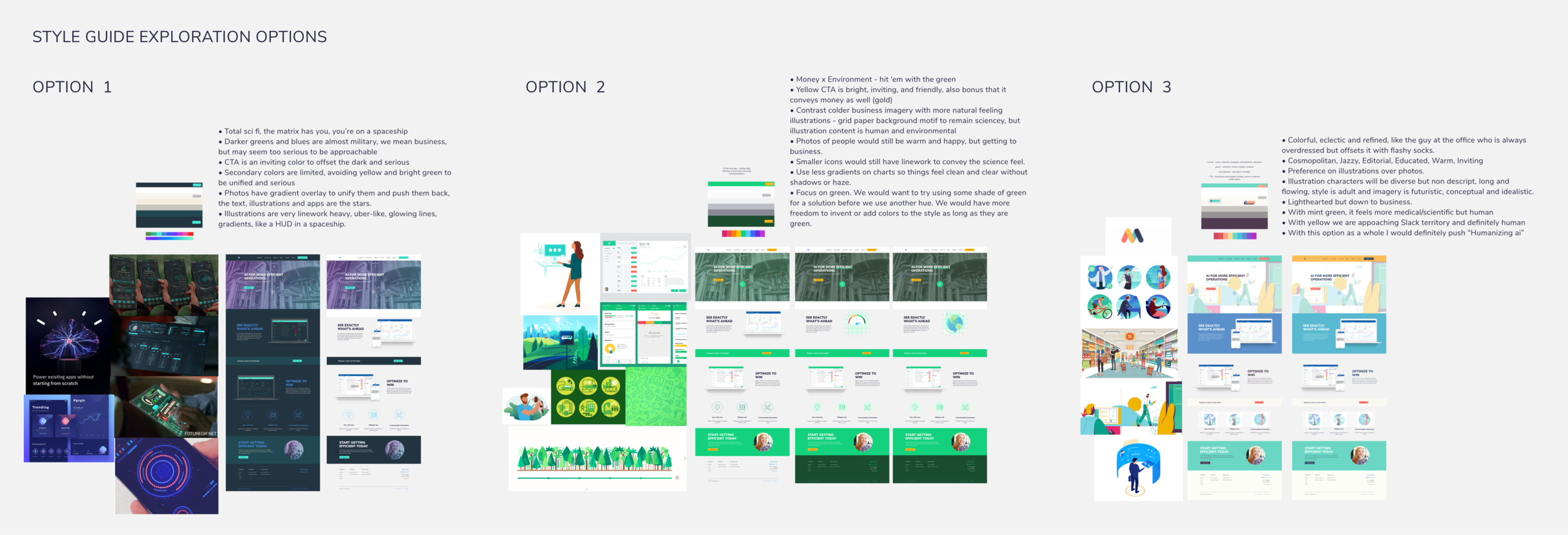
With this project we were starting from scratch on the branding, so I created several style frames capitalizing on several different important aspects of the company.
The first highlighted the cutting edge nature of the company’s solution, using data science and AI.
The second focused on the green or sustainable nature of the company’s goal, to reduce the carbon footprint of data centers.
And the third option sought to give the company an intelligent, yet human feel, given the company’s emphasis on highly educated personnel and great employee resources.

Page designs
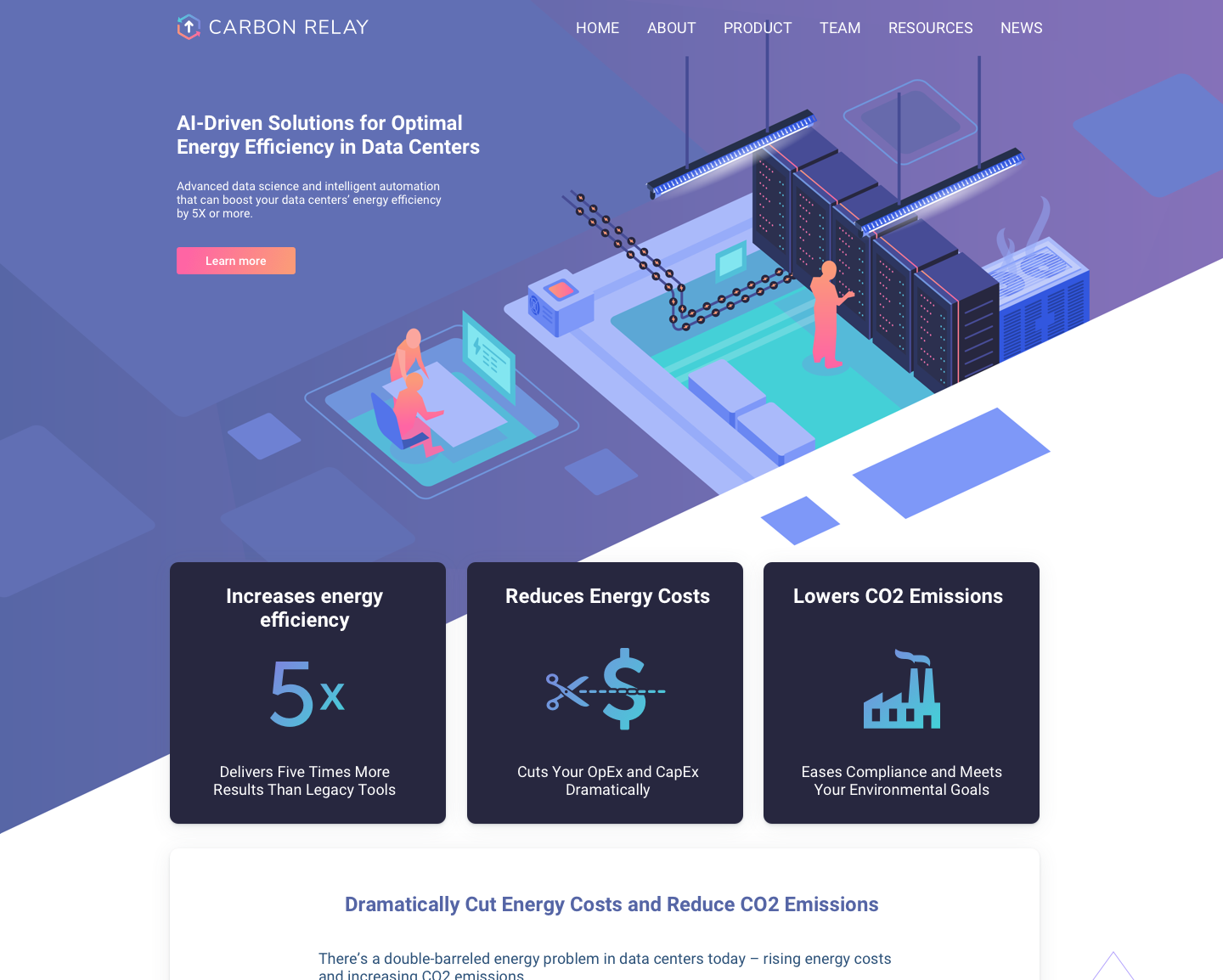
We landed on a variation of the first styleframe option. We were emphasizing the sleek, sophisticated, and intelligent nature of the technology the company used.
I borrowed the same warm and cold colors from the logo to be used in futuristic gradients and calls to action. I added purple as a main background color to represent intelligence and a heightened, majestic quality of the technology over conventional tools.
We strategized what pages were needed and what their goals were. Then we laid out the text content and calls to action for each. I later filed in layouts with design elements, illustrations, and more specific styling.

Hero image and illustrations
I created eye catching custom illustrations to pique the curiosity of site visitors. The colors worked together to lead the users down the page and to call attention to the various calls to action.
For many pages, the goal was to drive users towards signing up for our newsletter or towards contacting a sales rep. After launch of the site, we continued to optimize the layout and content to improve our results.
Now let’s get started on your project! Contact me with the form below, or shoot me an email at chris@cwestgate.com